Thursday, March 29, 2012

Vintage Color Palettes - Cape Code Auto Map


This pretty postcard makes me want to go to Cape Cod right now. It was sent to Texas in 1936.
The Hex color code numbers are, from left to right: a0e4dc, f3d3cd, fcdc6a, 9bd695


Monday, March 26, 2012

Vintage Color Palettes - Cape Foulweather


This postcard is from the early 1900's. A lovely comptemplative palette. 
The hex color codes are in order of l to r: 4b5f77, 654924, 9ebfc2, c9b461

If you want to discover your own vintage color palettes. You can find lots of vintage postcards and ephemera at my shop, The Cedar Chest

Thursday, March 22, 2012

Be Happy

For someone who creates zines and runs We Make Zines, you would think I would be right on top of all things zines. But, the truth is, I still have zines from last August's zine symposium I haven't read (probably some from the year before, too). It's not that I don't want to read them, I just want to be in the right mood and I have lots of reading competition taking up space near my bed.

So, with that in mind I can tell you truthfully that I have meant to do this blog post for many months. I first read this zine at the Portland Zine Symposium last August. I read it sitting at my table and felt so inspired by it, it totally set my mood for that day.

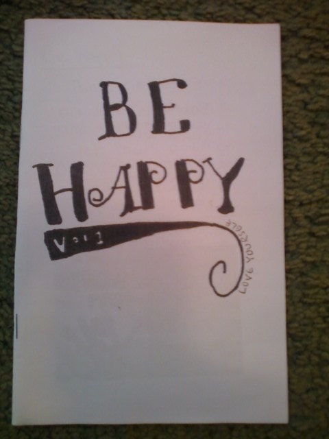
Be Happy is a zine by then 19 year old Jayna. It's a simple mostly hand written zine about loving yourself as-is and self-compassion. The simpleness of it is what affected me so much. There are lots of blogs, books and zines out there about this subject. Some of them are very deeply researched, academic and layered. That's great, I love that Fat Studies is out there. But, I say this because Be Happy is the opposite of that and it cuts to the core of self-compassion and accepting oneself. There is a time when you need deeper studies into fat oppression and self-love and a time when you just need it spelled out to you by a smart teenager. Jayna's zine is kind of like getting a pep talk note from your best friend passed between classes. And really weren't those the best!

Excerpts from Be Happy #1

Your body is yours to love and take care of. Love it as much (or more) as your favorite music, person or movie.

Everyone has their rights to self-worth. Degrading others to feel better about yourself is pointless because it starts to turn your 2 most valuable organs bad. Your heart for feeling the need to put down someone and your brain for processing and relaying the message.


Months later I got the zine Your Biggest Critic. This could be Be Happy #2.  This zine has lots of great points about self-compassion, too.

I recommend these zines for anyone struggling with these issues. It's just a good quick read that I could probably use every day - like affirmations. I especially think these zines would be great for a young person dealing with these issues. Having Jayna be closer to their age would inspire them even more and maybe encourage them to make their own zine. Just making a zine like this is great for the zine maker's self-esteem.

Visit Jayna's etsy shop. She has lots of other zines and projects, too.

Tuesday, March 20, 2012

Vintage Color Palettes - Hansa House


I wish I could visit this restaurant. It was in Phoenix, Arizona and is no longer. Such a pretty Scandinavian inspired palette.  The Hex numbers for this are, in order of left to right: 5ac0b0, f8574a, f8d36e, f8f8f8

Monday, March 12, 2012

Vintage Color Palettes - Public Library


A bookish and thoughtful palette for your Monday. 
Hex color numbers are in order for left to right: eac49b, 44454d, 5e8643, d85f41

Tuesday, March 6, 2012

Vintage Color Palettes - Coneflower


This color palette is one of my favorites. My bedroom is currently these shades of green and yellow. I even have a Pinterest board devoted to the combo.  

This vintage card is actually a small trade card that came in boxes of Red Rose tea. Each is only 2.25" x 1.50". I got a number of them and the colors are all really great.
If you want the Hex colors, they are in order of top from bottom: ade139, ffed65, ffd745, 51a01b.

Here's what the back of the card looks like:


Sunday, March 4, 2012

march


March is here. The above illustration is from A Child's Book of Poem's

Today was very spring like. The sun was out and I went to check out what's been popping up in the garden. My hydrangea bush still had some old dried flowers on it from late last summer, but among them many new buds.


Here is the contrast of dried up winter next to baby fresh spring. No judgement here. I like them both!
I pruned all the old dried flowers off the bush and now it's ready to grow into a big beautiful pile of hydrangeas. I love them. This bush started as a potted plant from Trader Joes.


The neighbor's dog, Clover, came by for a visit. She is super sweet and so well behaved.


Some other stirrings. 


And some cheery narcissus that are intent on keeping their heads down and facing away from the door. I snuck up on them.

I guess spring is coming. I do like it, I just feel like winter never got a real good showing. I am looking forward to flowers and California strawberries and sitting in the sun. 


Sharing is Caring