Saturday, November 16, 2013

Vintage Color Palette - Bridge in Autumn


Bridge in Autumn Vintage Color Palettes on Ponyboy Press blog
These are some of my favorite colors together. You see these colors used a lot in 1940's bark cloth fabric.  I love the fall colors. I don;t know when this postcard was made, but it was mailed in 1962 from Kay in Campbell, California to her nephew Steve who was in the service in New Jersey. Maybe she collected the postcard on some earlier travels to the far East.

The hex color number are from left to right: b8571a, 176a6b, 85803f, a93b2f. Wondering what you can do with these palettes? Check out my post about Using Vintage Color Palettes and all you can do with them. You can also see all of them on the Vintage Color Palettes board on Pinterest.

Sunday, October 6, 2013

Vintage Color Palette - Sunset on the Desert

Vintage Color Palettes - Sunset on the Desert - ponyboypress.com

This vintage linen postcard caught my eye today and it won out over some autumnal themed postcard - which I'm sure autumn color Vintage Color Palettes will be coming soon.  

These dusty colors are a wonderful combination and capture sunset in the desert pretty good. If you want the hex codes for this palette they are from left to right: a1ac99, e0cb48, b4aabb, 909ab0

Sunday, September 15, 2013

three things

twenty four hour zine screen shot
I want to tell you all about a really great series of interviews on the Twenty Four Hour Zine blog. 

It's called Live Fast, Die Old! Conversations with Zinesters of a Certain Age. Long time zine maker Josh Medsker interviews zine makers like Ben Snakepit, Joe Biel, Ken Bausert and many others about being over a certain age and still making zines. 

Josh and I recently had a conversation for this series. You can see all of the conversations, including mine at the Twenty Four Hours Zine blog.

       _______________________________________________________________________

Imaginary Life #3 - Ponyboy Press
I have a special re-release all color issue of my zine Imaginary Life 3#.  Imaginary Life #3 is 4 little zines - one for each season. It came out in 2003 and I always thought it was so pretty it seemed like a shame that people couldn't see it in color. So, for the ten year anniversary I printed up a very small amount of them in color. 

Imaginary Life#3 is all about my life over ten years ago. The struggles and deep thoughts of a single 30 something gal who had recently moved from California to Portland. IL#3 is in the Etsy shop now.

        ___________________________________________________________________________

Letter Writing Boot Camp - Paper Doll Army
Are you one of those people who misses the written letter? Were you a zine kid in the 90's and still pine for the days when people wrote back and forth and ordered zines through the mail? I was never one of those kids, but I do miss the written letter and I like the general aesthetic of writing a letter - the feel of the pen in your hand, the fast scratch of the pen to paper when your writing is trying to keep up with you head, the times of pondering and thinking as the page waits for your new thought.

If what you need is a kick in the pants to get back to writing through the mail, then the Radical Uprises's Letter Writing Bootcamp and Paper Doll Army Project is for you.  You order ration packs through the mail, you have missions and you get badges when you complete them. It's one of the brilliant, lovely and always uplifting projects from Jetta of the Radical Uprise. Check it out.

Sunday, September 1, 2013

Vintage Color Palettes - East Greenwich High School


It's a back to school Vintage Color Palette today. Such lovely crisp fall colors. The hex color codes are from left to right: b03539, 97b44e, 54643b, 8e4929.  Happy September!

Sunday, August 18, 2013

New Zine! Current Resident #4 - Read a Story

It has been a whirlwind the last 6 weeks and on my first day to sleep in (yesterday) I slept for 14 hours!

Yep, I've been tired. Between getting a new full-time job, finishing up freelance work, going to a three-day conference and then making a zine in a weekend for the two day Portland Zine Symposium - I have been WAY too busy for my taste or stamina. But, now things are calming down a bit and I'm ready for that.

I wanted to tell and show you my new zine. It's a collection of more house stories. I go through all of the many photos I have collected of just houses (no people in front or writing on the back, usually) and stare at them long enough till a story comes to me.


It's available in my Etsy shop right now.  Here is one of the fictions for you. There are 8 in the book. As I say in the intro, maybe I should call them "readings" instead of fictions. That's what it feels like when the stories come to me.

Excerpt from Current Resident #4:


Boy, did my father love to garden. He spent hours after work and all day on the weekends out in his yard, babying each plant and bush. He took care of his plants in a way I'd never seen him take care of me or my baby sister. There was no yard for me and my buddies to play catch in. No yard for Sis to play Ring Around the Rosie. It was all blooms and bushes and it was overwhelmingly beautiful.

When he would come home from his unremarkable job at the shoe store he would change clothes and then drag Sis and me outside to see what had developed since that morning.  Standing among all those plants when they were blooming like in this picture - it smelled like fancy ladies perfume and ice cream sodas. Sometimes surrounded by all that pungent pollen my head would buzz in a uncomfortable way and I felt like I was turning into a bee.

My father would beam. My mother scoffed,  and she and her parents often made fun of his gardening.
If she had enjoyed the garden like he did or if she had loved his passion for it, life would have been easier. Growing up there would have been more like it looked from the outside - cheery, lovely, prolific.

Instead Mother resented it and I'm ashamed to say that my sister and I took our cues from Mother and her parents - which only made him spend even more time outside. One summer I helped him almost every afternoon for a month and he was a different man out there. He was joyous and silly. He reveled in the comments of neighbors walking by, flitting like a hummingbird from flower to flower, soaking in the way the plants responded to his touch.

I pulled away from helping after my mother called him a pansy once. She said he was like his garden. Grandpa nodded as if he had  come to the conclusion a long time ago. My father looked stung and I saw a slight movement back as if an invisible hand struck him but went through him instead of hitting him. He let out a "Huh" sound, barely heard over my mother's cackling. Then he downed his iced tea and went back outside.


Wednesday, July 3, 2013

Happy July - Let's Celebrate International Zine Month!


July is International Zine Month. Are you gonna take part in the festivities?  What are the festivities, you ask? Well, first and foremost is making a zine. Lots of Zine Fests happen in July and August, so many people are already working hard on zines to have for the festivals.

There are a lot of other ways you can take part and International Zine Month and Stolen Sharpie Revolution have created a 31 Days of IZM list for you. It includes an activity for each day. Do all of them or do a few, either way you'll be celebrating the awesome and revolutionary craft of making a zine. Lots of people are checking in to We Make Zines and posting what they are doing on their blogs. If you want to get some ideas check out We Make Zines.

Day 2 called for a list of ten things you like about zines. Okay, here's my list:

  1. You don't need a grant, a publisher or permission to make a zine.
  2. You get to meld images and words in any way you want.
  3. You can learn as much as you want to in zines. So much information! Lots of it not covered in other publications.
  4. It is very satisfying to hold a finished zine of yours in your hands (and to give it out).
  5. Zines are art
  6. You meet and connect to some amazing people with zines
  7. You can design the text in a way that forms the way a person reads the zine.
  8. Zines are fun and take little money
  9. Zines give you a creative outlet.
  10. Zines can be done by anyone!

Day 3 of 31 Days of IZM is Distro Appreciation Day. I'll list my fave zine distro's here.  Check them out and spread some money around there if you can. Distro's are always a labor of love and I would hate them to disappear.


Hopefully, I will check in more this month with more 31 Days of Zines, but, um, I also got to get to making that zine for the Portland Zine Symposium in August.  Feel free to share links to your blog posts about International Zine Month. Happy July!

Friday, June 21, 2013

Body Positive Printable

Boy, I am getting some stuff done this week. As Clutch would say "I'm kicking life's ass". You know how there are some things on your list of things to do that are easily pushed aside for other things? I'm getting to some of those this week and it feels good.

Right now what I have is a printable 5x7 body positive inspirational print for you.  In 2005 I created issue #3 of Figure 8 zine (currently out of print). I made the subtitle and theme "The most revolutionary thing you can do is love your body".  I kind of doubt I'm the first one to say it, but through the zine the message reached a lot of people and I was happy to see the enthusiastic responses.

So, now, it's 2013 and I still print and sell some issues of Figure 8. I wanted to revisit that phrase and create a printable or postable image for your online outlets (click on it to go the flickr page with the large printable file).


I still believe this, but I might rephrase it if I was writing that zine now. Love is a word that can be easily dismissed or trivialized. We use it so much in so many ways. What we really need to have a revolution is to completely and utterly accept our bodies as they are - as is. And of course, this is what true love is, but, like I said, I think it is easy to forget this sometimes when throwing the word love around.

So, can you imagine it? Can you imagine if all women, men and children everywhere (or even just in this country) simultaneously no longer cared about their looks and their size? What kind of energy would people have left over for themselves and others if they are no longer hating themselves or trying to fit themselves in a mold that is not their size? And what would they do with that energy? Perhaps they would help other people more. Perhaps they would exercise for fun and eat what their body craves naturally and not what is morally acceptable.  Perhaps they would save lots of money and have more time to think about things other than what their body looks like. And, even more exciting - with this lack of judgement on themselves people would no longer judge other people on looks or size. Can you imagine the ramifications of that?

I hope you'll print this up or pin it on your Pinterest board. Share on your social media networks and when you do think about and share one thing that you can see happening if people could all finally and truly accept and love themselves as they are. <3 p="">

Wednesday, June 19, 2013

Vintage Color Palettes - Worlds Fair - Expo 1974

vintage color palettes - vintage expo fun and entertainment 1974 worlds fair - ponyboy press

I love these colorful, oh so 1970's style illustrations that were used for the 1974 World's Fair Expo in Spokane, Washington. The color combos are pretty great and definitely vintage. 

I listed these three postcards (there is 1 other one) on the Etsy shop today.  

Are you a bright colors person? Do you love these? How would you use these combos?

vintage color palettes - washington state pavillion world expo 1974 - ponyboy press


Thursday, June 13, 2013

You are Invited to Be Who You Are - Free Inspirational Printable


When I was a teenager in Southern California I picked up this postcard somewhere. Maybe at Pier One or maybe at some head shop or natural foods store by the beach. I have no idea. But, I have had it up on my walls most of the three decades that have followed. I taped it up so much that the back has had most of the paper torn off. All I can tell is that the last name of the photographer was King and it was printed in 1982.

I love everything about this postcard. The quote, the torn paper which is a broadside from 1967 printed in Boston, the glimpse of another flyer on the side, the wood wall.  Interesting that one generation made this broadside. Then someone sold a photo of it to the next generation. And now I am here passing it on. Although, I don't want to take this guys photo, so I decided to make a totally different kind of printable of this favorite quote of mine.

Here is the print I made. It's available in 5x7 and 8x10 and prints on a regular 8.5 x11 paper. Just click on the size you want and save to your computer.  I hope you enjoy it!

...And, wow, I just realized that I didn't get this quote exactly right. Can you spot it? I researched it and the quote is quoted both ways, but from an actual Thoreou book I found it as "what we are".  But, you know what? I'm going to embrace who and what I am - which is the kind of person that didn't get this quote exactly right - and just present it as is. An inspirational quote that I have enjoyed for years no matter what or who you are.

Invite to be who we are printable 8x10
8x10 Print


Invited to be who you are Printable -5x7

Sunday, June 9, 2013

Whatever Watermelon Salad and my Kitchen Confession

Whatever Watermelon Salad - Pnyboy Press blog
I am the kind of person who doesn't read instructions much. I like to get in there and just figure it out. Sometimes this works great. Lots of times it doesn't.  I'm kind of like that with cooking, too. With baking I'm more careful (but not by much). I have a bit of a devil-may-care attitude about cooking - especially if it's just for myself. I collect recipes on Pinterest and have many cookbooks and yet, when it comes down to it I usually just make something up.


So, yesterday I got the idea to make a watermelon salad. I looked up some recipes on Pinterest, but none of them were really what I wanted to do. So, I just kind of did my own thing. I made a watermelon salad with cucumbers, blueberries and mint. I added some things to make a dressing and the result was really good. Here is a sort of roughed out idea of what I did (what, me measure?) so you can use it as a guide for your own whatever watermelon salad.


watermelon salad - ponyboypress blogMy version of Whatever Watermelon Salad

About 4 cups cut watermelon
1 cucumber, peeled and cut up
About 1/2 cup blueberries
Mint leaves, roughly chopped up (I used Lavender Mint from my garden)

Dressing

1 tablespoon Olive Oil
1 tablespoon honey
1 tablespoon Lavender Lemongrass Vinegar.
( I know not everyone has this sitting around. But, I recommend trying something that would give it just a little bit of some unique little tang. This vinegar is perfect as a secret ingredient in things. It adds so much, but you can't quite put your finger on it.)
a pinch of salt and a little bit of pepper if that's your thing.
Whisk together and gently toss with the fruit salad

You can eat right away, but it's better if it sits for a bit. The second picture is the salad the next day.

Are you a perfect cook and stick to recipes or are you like me?  I'll call it creative (but I have also called it half-assed).


Sunday, June 2, 2013

Vintage Color Palettes - A Happy Birthday


An odd assortment of colors on this Vintage Birthday Postcard. It was sent in 1929 to as Woman named Mrs. E.A. Christenson. It was her 45th birthday as the person noted on the message so all could see. It was sent from Authur, Iowa to Soiux City, Iowa.

Colors in general were very unique in the Twenties. Especially the last half of the decade. It was very popular to use strange combinations of colors for things, kind of like what happened in the last half of the 1960's. I wrote about some of this in regards to 1920's Christmas Cards on my other blog The Cedar Chest.

The hex color codes are in order from left to right: 5ba87a, d5628a, 466b55, ad6164. If I were going to name these colors I would name them Carnival Glass Green, Peony, Spruce and Faded Velvet.

Do you like this combo? It's very unique and not like you usually see today, especially considering the added teal, yellow and olive green checks.


Tuesday, May 14, 2013

Using Vintage Color Palettes

I love making my Vintage Color Palettes. One of the things that has always drawn me to old postcards and ephemera is the colors - the combos and the hues. So, once I hit on the idea of showing them off in Vintage Color Palettes it was hard to believe I hadn't thought of it before. It was a natural.

But, what do you do with them you might ask?

Well  you can use them for decor or entertaining inspiration for one. You can plan rooms or weddings by them. But, you can also use them in many ways for web design.  You could use a favorite combo for a blog or website design. You could also use them for a special poster or other illustration. You could upload them for custom phone covers or water bottles - anywhere you upload your own image on a product.

You could also use them to make background papers for your blog, website or for bookmaking or scrapbooks.

Have you heard of Colourlovers? I found this again recently and got pretty obsessed with it. Colourlovers is a place where you can make your own patterns and palettes. You can also color patterns created by other people. This seemed like a perfect opportunity to use the Vintage Color Palettes. And man, it's fun!

Example of pattern on Colourlovers
This is where the hex color codes come in. The hex codes that I provide on each Vintage Color blog post gives you the exact code for that color. Just replace the greyed colors with that code and you'll soon have something made with your favorite Vintage Color Palette!

So, here are 3 backgrounds using Vintage Color Palette combos. You can click through to Colourlovers and save these to your computer (just use alt + print screen on the large image) and use for tons of different things. They even have partnered up with Spoonflower (custom made fabric) and Imagekind (print on demand prints and prints on canvas). The truth is there is way more to the site than I have had a chance to check out yet. So, take a look see and now, onto the prints!

This simple chevron print was inspired by the Palms of Florida Vintage Color Palette:


vintage color palette chevron print on colourlovers

I wanted a kind of mid-century print for the Monarchs of New York palette.

mid century abstract vintage color palette print from colorlovers
And of course something sort of old fashioned and pretty for this early 20th Century Reward of Merit Palette:
floral wallpaper print vintage color palette from vintage ephemera

Click on any of those links in the description and you will be taken to the pattern on Colorlovers. If you use them, I'd love to see how. If you make your own - with the Vintage Color Palettes or not, I would also love to see what you've made. Feel free to follow me on Colourlovers


Saturday, May 11, 2013

Vintage Color Palette - Perfect Salad


Maybe it's the 70's child in me showing - but I love this color combination. This pamphlet put out by Mazola, is, however, most likely from the 1930's - there's no date on it. Such a gorgeous color combo. I like it when they use a bunch of similar colors in things like this.  The hex color code numbers are from top to bottom: dd852d, 5b8948, ffc033, c5571e.

If you're interested in what's inside. Here are a couple pages. I like it when they say in these types of things "the modern housewife" does this and that. It's like they are kind of shaming people into buying their stuff, Like if your not into this your not modern. Modern was a big things during this time, - and not surprising since in a span of about 20 years so many houseworking devices became available to the average American.


Thursday, May 9, 2013

Vintage Color Palettes - Palm of Florida


This color palette come from a vintage linen postcard from around 1946. The hex color codes are from left to right: a4b952, f7b198, 68a6c7, 5e704e.

Wednesday, April 24, 2013

Strawberries Stuffed with Black Pepper Lavender Cream Cheese

strawberries stuffed with black pepper lavender cream cheese! - ponyboy press blog

Last week I was invited to a delicious brunch by my friend and charming blogger Sarah from New Wave Domesticity.  I am recently having to eat Gluten Free because of an auto immune disease I had just found out about. Sarah happily took on the challenge of a Gluten Free Brunch which was so awesome. It was delicious! Check her blog for the recipes she made.

I wanted to bring something, but I've been sort of stumped about what to make with the whole gluten thing  being an issue. I had strawberries and cream cheese in my fridge and I remembered seeing a recipe on Pinterest with cream cheese stuffed strawberries. But, I wanted it to be more interesting than that.

The Capicorn Cocktail at The Observatory - Portland - Ponyboy Press blog
The Capricorn Cocktail 
It came to me immediately how to jazz it up, because just the day before I had been at The Observatory here in Portland for the first time and had two fabulous Strawberry Black Pepper Cocktails (strawberry puree, vodka, black peppercorn syrup with a salt and pink peppercorn rim - so good!). But, to make it even more interesting I used the  Lavender and Black Peppercorns in my grinder and then added even more pepper.

I don't have an exact recipe, but used about 3/4 cup cream cheese, 2 tablespoons honey, and just ground the pepper and lavender combo & then the black pepper until it looked like how I wanted. I then mixed it all together and put it in a pastry bag (and like an idiot forgot the nozzle, so that's why these are not as pretty as they could be - can you tell I don't use my pastry bags that often?). I then did a little sprinkle over them with the Lavender Pepper.

These were pretty darn delicious - refreshing and creamy, but then they had this complexity with the pepper and the subtle lavender flavor. I recommend the combo. Also, I made them the day ahead and then covered and put them in the fridge and they were just the same a day later as they were when I made them. Just remember to kind of let the strawberries dry a bit or pat dry after rinsing. I love strawberry season!

Tuesday, April 23, 2013

Vintage Color Palettes - Florida Orange Meringue Pie

Vintage Color Palettes - Florida Orange Meringue - ponyboy press

I found this lively postcard among a bunch of 25 cents postcards last weekend. It definitely stood out and I loved the intense blue background which is even stronger than shown here, but that was the closest I could get it from the scan. The weather has been sunny here and this color palette fits the mood. The rest of the recipe is printed on the back. I'll post it here. Let me know if you make this. it sounds pretty good. I like the idea of sending a regional recipe in a postcard. It makes it even more of a souvenir.

The hex color codes here are from left to right: 0393c4, f75b0d, 408444, f7d45b. 

Famous Florida Dessert - Orange Meringue Pie Recipe - ponyboy press

Wednesday, April 17, 2013

Poem in Your Pocket Day 2013

Tomorrow is National Poem in Your Pocket and once again it kind of snuck up on me and I didn't have the time to do a nice layout like I think I will do all year long.

However I do have a poem to print and share tomorrow. It's called I Have News For You by Tony Hoagland and I kind of felt like he'd been in my head when I read it. Maybe you can relate to it, too.

Here is the scan of what I will handing out to people I see tomorrow.

You still have time to find a poem and print it out. There are ones all ready to go on the official Poem in Your Pocket website or you can find your own.

Happy Poem in Your Pocket Day!

poem in your pocket day poem for 2013 - ponyboy press

Sunday, April 14, 2013

Vintage Color Palettes - The Buzza Co.


This color palette is brought to us by a greeting card. This card is the kind you can stand up and you can see the cut out in the middle of her dress there, but the pleats along her waistline are also cut out. I'm not sure what it was supposed to look like all propped up, but I don't want to ruin the piece to see. I guess the person who received this felt the same way. I don;t think the recipient displayed it that way.

On the back of the card it reads:

Well old dear. I hope you have a merry 
Christmas and a happy New Year 
also that you get a lot of nice gifts.

As Ever your
Friend
Gertrude Brown

Some very springy color for a Christmas card. Such a lovely card made by The Buzza Co. in Minneapolis, USA.  No year noted, but based on the fashion, I think we can assume it's around 1930. The hex code for the colors are from top to bottom: fceb85, aba3ab, f52658, fdb5b3

Saturday, April 6, 2013

Vintage Color Palettes - Gates Ajar

Vintage Color Palette - Gates Ajar - Providence RI - Ponyboy Press

This beautiful spring time vintage color palette comes from a postcard that was sent in 1942 from Providence, RI to Columbia S.C. Tiny was still getting settled in for her vacation. This park still exists, but it looks like this particular section is no more.

This postcard gives a nice vintage version of some spring colors. The hex color code numbers are from left to right: 95ae5a, 90b9bb, cf4041, e9d654

Wednesday, April 3, 2013

You're Invited to an Herb Themed Tea


The Menu

Peppermint Tea
Lavender Pepper Scones
Dill and Goat Cheese Sandwiches with Lemon Delight Herb Vinegar
Goat Cheese Brie and Spinach in Nasturtium Vinegar Sandwiches
Mandarin Quinoa Salad Parfaits
Rose Apple Tarts

I had a wonderful time a couple of weeks ago setting up a fancy tea for my friend Sarah of the blog New Wave Domesticity. I've been doing some website work for the delightful Blue Heron Herbary on Sauvie Island and they had set me up with some delicious herb blends and vinegars that I wanted to try out in some recipes. So, an herbal theme tea party seemed like the perfect fit for our tea-for-two meeting.

Lavender Pepper from Blue Heron Herbary
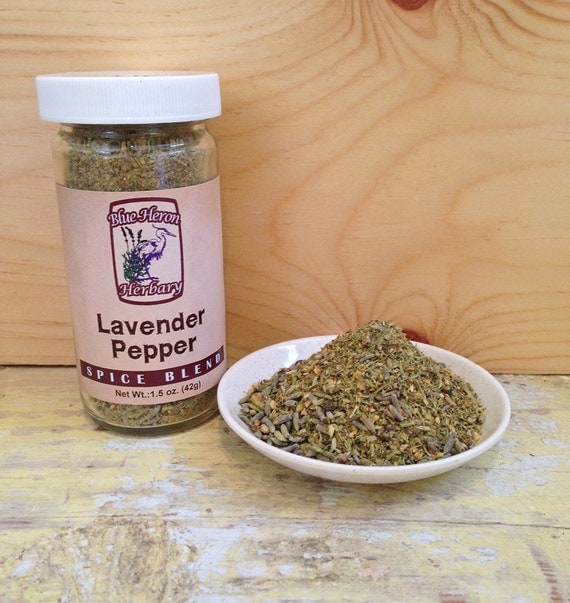
The first thing I was inspired to make were the Lavender Pepper Scones or Biscuits. From the first time I smelled the herb blend that they make at Blue Heron Herb Nursery from their scores of lavender fields (they farm and sell over 100 varieties of lavender) I knew I wanted to make scones with it. I love a savory scone - with butter of course.

The Lavender Pepper Herb Blend is the most popular of Blue Heron's blends. I am not a huge lavender flavored girl, but I was encouraged to at least give it a smell. After that I was hooked.  It isn't super lavendery, but just enough that it give it this really interesting savory taste. I used a mixture of the Lavender Pepper Blend (which also includes some other ingredients) and the pure Lavender and Rainbow Peppercorns option that I put in my own spice grinder.

The result was delicious! I chose to make them biscuit shaped, but they were more scone like. I could have made them a little thicker and more biscuity, but they were great as is. Kind of dry and  flaky and so ready to have some butter on them. Just how I like my savory scones. I just loved all the pepper in them and the lavender made the taste so unique and full.

Lavender Pepper Scones Recipe - Ponyboy Press

Lavender Pepper Scones (Biscuit) Recipe
2 cups all purpose flour
2 tsp baking powder
1/4 cup salted butter, cold and cut into small pieces
1/2 cup plain greek yogurt
1/4 cup milk
1.5 teaspoons Lavender Pepper Blend
2 tablespoons Lavender Rainbow Peppercorns
1/4 tsp baking soda


1.Preheat oven to 400°F (200°C). In a large
bowl, mix flour, baking powder, lavender pepper
blend and lavender peppercorns. Working quickly, add cold butter, blending with fingertips until evenly distributed.
2.In a large bowl, mix yogurt, milk and baking soda. Pour over dry ingredients and mix until just combined. Turn out onto a floured surface and knead until dough just holds together. Do not overwork. Pat or roll into a 1/2- to 3/4-in. (1 to 2 cm) thick disk.
3.Using a 3-in. (8 cm) round cutter (or a floured jar lid or glass), cut dough into 9 or 10 rounds (gathering scraps to re-roll and cut to use up dough). Bake on a parchment paper-lined baking sheet for about 15 min. or until lightly browned. 


I adapted this recipe to use for the scones.  It called for 3/4 cup buttermilk, but I didn't have any so I used the yogurt and milk combo. I found the sub online somewhere and it worked great.  Also, the amount of Lavender Rainbow Peppercorns I used is a guesstimate since I just kind of kept grinding it in till it looked good. Add as much as you want. I also sprinkled them with some more Lavender Peppercorns on the top, but I can't remember if I did it before or after.

These are so good, I am still craving them and they are long gone.

dill goat cheese and lemon delight vinegar tea sandwiches - ponyboy press
Dill, Goat Cheese and Lemon Delight Vinegar Sandwiches
Also on the menu that day were some delicious tea sandwiches inspired by the Herb Infused Vinegars from Blue Heron's Three Bird Vinegar and Dressings.

goat cheese brie and nasturtium vinegar tea sandwiches - ponyboy press
Goat Cheese Brie and Nasturtium Vinegar Spinach sandwiches
I made these Dill and Goat Cheese Sandwiches by using a soft spreadable goat cheese and cutting up a bunch of fresh dill. Mmm. So good.  I used about a tablespoon or two of the Lemon Delight Vinegar, which is a combo of lemon basil, lemon thyme, lemon verbena and lemon peel in a white wine vinegar. This is my favorite vinegar so far. I tasted the sandwiches before and after the vinegar was added and it made such a difference and yet it wasn't obvious what it was. It really brightened the filling. They were super good. I love this vinegar for asparagus and all vegetable steaming, too.

I also used the very interesting Nasturtium Vinegar from Three Bird. Nasturtium flowers have a peppery summery taste. I tossed some spinach in them and then added them to some Goat Cheese Brie. It made a nice sandwich that had a good amount of veggies in it, unlike the other offerings. The Nasturtium Vinegar added a unique and layered taste to the simple sandwich.

The tea was rounded out by a favorite easy dish of mine that I found on Pinterest - Mandarin Quinoa Salad Parfaits. I added some of Three Bird Vinegar's Bouquet of Roses Vinegar to this sweet and nutty tasting salad. It added an extra depth to it and mixed well with the fruity flavor.

Sarah brought with her these darling Apple Pie Cinnamon Bites that looked very impressive and were delicious.

It was so fun to do a tea party like this again. Thanks to Blue Heron Herbary for the inspiration. I am a new devotee to Herb Vinegars and Lavender Pepper. Oh, and Blue Heron Herbary is having a 20% off deal through May 1st on all products on their Etsy shop. Check it out and get some herbal inspiration, too.


an herbal tea party - recipes and ideas at ponyboypress.com


Friday, March 29, 2013

sifting through the years


This is the sifter that I use every time I need to sift flour. It was given to my mother who told me that it was her grandmother's.


My mother was raised mostly by her grandmother. Her grandmother was Mabel Smith. A strong woman of Scottish descent who's ancestor's had been in America since before the Revolutionary War.


Great Grandma and Grandpa in later
years when my mother was young

Mabel was running a boarding house in Kansas when she met her second husband, my great grandfather, who had been, among other things, a heavyweight boxer.


They were married for the rest of her life. I never met my great grandmother, she died the year I was born. But, I do remember Grandpa Pat, as he was called. He was a cantankerous old man, who was very large, ate bacon and eggs every day, smoked a pipe and lived to be 94.

I love using this sifter. I think about the history while I sift my flour and baking powder.

I imagine my great grandmother using it in the 1920's to make my grandmother and her sons biscuits and later using it in the 40's to make treats for her granddaughter.

I imagine my grandmother (also named Mabel) using it to bake Christmas cookies for the family.

I imagine my mother, a young mom in the early 1960's making cakes for her two young daughters.

And now, almost 100 years later I am still using it. Shaking my wrist slightly back and forth in the same way they all did. Melding ingredients to make warm baked treats for the people I love.


Thursday, February 28, 2013

Vintage Color Palettes - All Your Way with Flowers

Vintage Color Palettes - All Your Way with Flowers - dark teal, orange, green, taupe

This is such a lovely, dusty, melancholic color palette from a poetic postcard from 1908. The dark teal color of the forest with the orange twilight (or maybe sunrise) hitting the trunks and making it all glow and in front a bundle of, what are those, lillies? They've been left there, bundled in twine, adding more to the story. And the verse on the front:

Time that with noiseless foot keeps step with you
Strew all your way with flowers

The postcard was printed in Germany, sent from Racine, Wisconsin to Clinton, Iowa on April 15th, 1908. The colors here are different than what you see now, at least in this combo. The hex color code numbers are from top to bottom: 447065, f28146, 94bf8c, b68a5e


Wednesday, February 6, 2013

Zine Love for Valentines Day

This Saturday I will be participating in the mini-zine fest that is AmaZine Day at the IPRC in Portland.

You should come by and shop for some zines and little handmade valentine gifts. You can also learn how to make a one page zine - a perfect valentine for that special friend. There will be readings and snacks, too.  Hope you can come by!

Are you starting to think about homemade Valentines for your beloved or best friend? Here's an idea. A few years ago I made a sort of mini-zine for the mister.

I used vintage wallpaper as the cover and hand wrote each page. It was pretty cute and fun to do.


I also have a Pinterest board full of Valentines ideas. Take a look at that if you need some inspiration.

And rounding off the zine love theme, I want to point you in the direction of this lovely post from Magpie Librarian who recently got a Figure 8 Body Love pack. So fun to see stuff like this. Thanks for the post, Magpie Librarian.

And just to round it off, I do have a nice selection of vintage Valentines in The Cedar Chest shop.

Happy Valentine Scheming!


Friday, February 1, 2013

Vintage Color Palettes - Monarchs of New York City


This vintage postcard shows a unique sophisticated color palette from around 1940. The R.C.A. building is now known as the G.E. building, the home of NBC and Rockefeller Center.

The hex color codes for this palette are from left to right: f7d35e, c4c1c1, df382d, f5b363

Friday, January 25, 2013

winter treats

Winter is the kind of thing most people don't like. Especially after the holidays are over. I like the quiet months of Janurary and Feburary - the bare trees, the grey skies, the need for cozy socks and warm foods. Although there is less produce at this time than during the summer, there are still some great things in season (though not local perhaps) that are a nice treat at this time.

Lately, I've been really into grapefruit, kiwi, meyer lemons, oranges and avocados. These are all in season somewhere and really inexpensive at the stores right now.

I made a lemon meyer bundt cake the other day. I used this recipe on Pinterest. I started a Pinterest of tested recipes. It shows the recipes I've actually done and my comments on them.

The last few days my lunch has been an open face avocado sandwich. Avocados are so good right now and cheap. This sandwich is super good. It satisfies the Southern California girl inside me who grew up eating avocados all the time and stealing lemons off of nearby trees. 

Let me break it down, in case you wanna create it yourself. 


Yellow Mustard
Artichoke Antipasto from Trader Joe's
Avocado
little salt

Delicious! 

Sharing is Caring